It’s been a while since we announced any updates about KyLeads.
That’s because we’ve been hard at work behind the scenes making a lot of improvements to current features and launching new features as well.
We’re also preparing for something big and needed to revamp parts of our codebase for speed and reliability.
Today, I’m going to give you a quick rundown of what’s changed and a sneak peek into what we’re going to be doing over the next few months.
Universal embed code
Previously, it was necessary to grab a code after you made every popup and then paste that into the page where you wanted it to appear.
While that worked well, it limited the kind of display and trigger options you could take advantage of. For example, it would’ve been impossible to set a trigger to show a popup after a visitor browsed 3 pages.
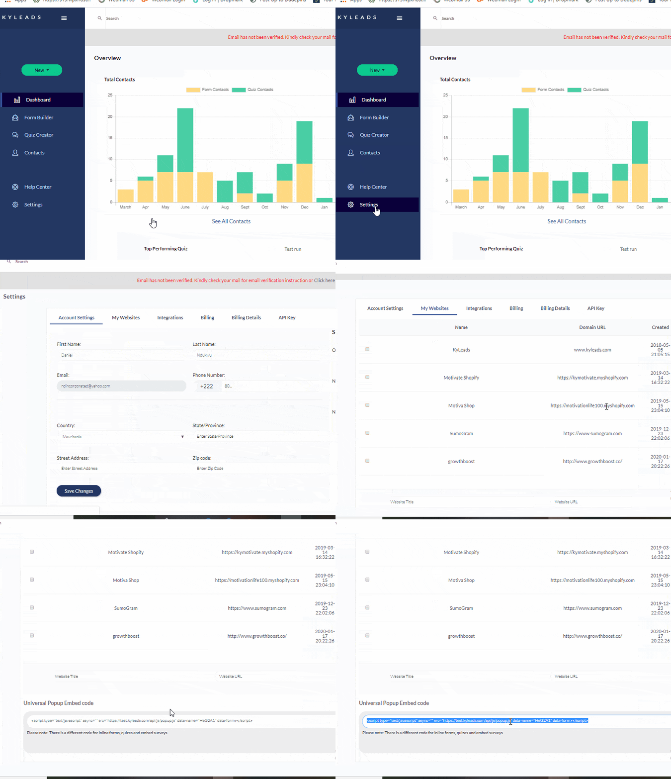
We’ve moved over to a universal embed code that you can grab from your website setting page.

This makes it much easier for you to set up popups and implement robust targeting. All you have to do is configure the targeting (for example, appear on pages that have ‘cool’ in the URL) and hit publish. Your popups will automatically start appearing and collecting new subscribers.
This also opens up the doors for a wider range of targeting options.
Updated the slide-in lead capture form
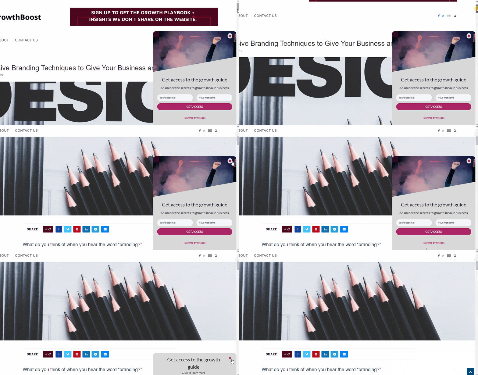
The slide in lead capture popup has gotten a bit more functionality. Previously, if someone pressed the X button in the corner, it would disappear. Now, instead of disappearing instantly, it gets minimized and the heading is still visible.

What happens if someone changes their mind after reading the content and actually wants to sign up? Previously, that was impossible. Now, since the slide-in minimizes instead of disappearing, they have that option.
In its minimized state, it takes up very little screen real estate and it can be opened or dismissed permanently with the click of a button.
Mobile display updates
All of the popups have gotten an update on mobile. We’ve restricted their maximum size so they’re in line with Google Interstitial guidelines by default.
It’s important to note that if you enter large amounts of text into the popup it will stretch to accommodate it. But, if you follow opt-in form best practices, you have short snappy copy and your mobile popup will be perfect for small screen sizes.
Recommended image dimensions
We like giving you the freedom to customize and edit everything as you see fit. Unfortunately, that doesn’t always bring about the best looking forms and popups. Many things get cut off, get stretched, or even compressed.
We’ve gone through and added recommended image dimensions everywhere you can upload an image. Now, you’ll know exactly how to format your image so it looks good on all devices and in all cases.
Template tweaks
We went back through and tweaked many of our templates so they look better for the end-user and are more likely to get someone to sign up for your offer.
Some of them were just a few pixels off here, a little too small there, etc. We took a forensic comb to them and made them even more beautiful then tested them to ensure they were reliable.
You may not notice the difference but your visitors will be signing up even more often because of it.
For the inline forms, we’ve tweaked them so you can fit a bit more text to get your message across.
For quizzes, we’ve made them a bit larger and changed the dimensions so they look better on both mobile and desktop devices.
UI/UX updates
We’ve made a number of tutorial videos to help guides to make it easier to get started with KyLeads when you first sign up. Instead of one big one that tries to walk you through everything at once, they’re broken down into smaller lessons and appear when you want to do something for the first time.
For example, if you want to create an opt-in form for the first time then you’ll see a video related to that. If you want to create a quiz for the first time then you’ll see another video related to that.
We’ve also removed some elements in the UI we realized were causing confusion. For example, some of the preview panes are gone because they had strange formatting and weren’t helping you determine what the popup or quiz would look like to your visitors.
We’ve moved the preview to a dedicated page that even has a bit of text to simulate a real webpage. That way, you can see exactly how your popup/quiz will look for your visitors and make tweaks until it’s perfect.
Apart from that, we’ve added a few buttons and microcopy to make navigating around KyLeads easier.
Bug squashes
We took out a lot of bugs over the last few months and they’re too many to name them all so I’ll just give you a quick rundown of what that entails.
- Fixed popup text losing its formatting at times (text color, size, alignment, etc.)
- Fixed button colors reverting to the default after saving and publishing popups
- Fixed temporary form redirect issue
- Fixed a delay in updating popups and quizzes after images have been uploaded
- Easier access to embed codes when applicable
What’s next
Most of our time was spent on under the hood features that are preparing us to take advantage of many new features we’re rolling out. Stay tuned because KyLeads is going to be completely different by the end of 2020.