I can guarantee you’ve experienced message match while wandering the internet (or a failed attempt at message match).
Think about the last time you clicked on an ad, social post, or link in an email. Were your expectations met or were you wondering why you were sent to that page?
If you were confused, then you’ve experienced message mismatch.
Message match, put simply, is when you experience what you expected. You click on a link about cool boots and see a page about cool boots.
Message match is how well the imagery, copy, intent, and messaging on your pages match the content used to drive traffic to said pages.
It sounds simple right? It is. Most people get it wrong.
Why?

Maybe they’re lazy or maybe they don’t know what message match is. Whatever the reason, message mismatch kills your conversions.
Only 48% of marketers create a new page for each marketing campaign. Think about that for a moment. Messages untailored to the ad, email, social post, etc. that brought your visitor to the page are shown.
What’s expected isn’t what’s received.
In this post, we’ll explore how to get message match right. Let’s start with what not to do.
Examples of message mismatch
There are different types of message match and by extension, message mismatch. It goes beyond the right things on an ad and its landing page. That’s the first step but by no means the last.
The challenge with other types of message mismatch is they’re hard to detect. Let’s take a quick look at them.
- Campaign and audience mismatch
Alright, you’ve got your campaign dialed in. The ad copy is on point, you’ve got a nice creative, and your landing page reflects your promise. Nothing can go wrong – right?
Not exactly.
What happens, more often than not, is the wrong people are targeted. It’s a subtle problem that no one can tell at a glance.
If you’re selling a forex course, how would you know men trade 45% more than women? You won’t. The only way to find out is to run small-scale tests and see what the data tells you. You could run low budget ads, start a blog, do a few guest posts, or launch a social media campaign.
The method you use isn’t important. What’s important is to make sure your campaigns are targeted at the right people before you invest time, energy, and cash on a message that doesn’t resonate.
An ad tracker like Voluum makes this a bit easier. Instead of moving through the different platforms you’re using and spending hours collating data and figuring out which campaigns are performing, it’ll help you compile that data.
- Ad/email and landing page
This is the most common form of message mismatch and the easiest to spot. We see messages all the time – social media posts, ads, and search results all qualify.
The message doesn’t matter so much as what happens after you click it.
We leave the page we’re on and follow the link expecting to see a specific message. If you’re on Facebook and see an ad about a sale on boots and a picture of those boots, you’d expect to see a specific pair of boots on the page.
In the ad below, I’m led to believe I’ll learn about the disruptive nature of blockchain technology.

On the page I’m sent to, the first thing I see is a headline talking about a company that wants to get big. How does that have anything to do with Blockchain disruption?
Reading further, I discovered their innovative approach to using blockchain technology as a disruptive force in their industry. This company recognizes the transformative power of blockchain and seeks to use it to revolutionize traditional business models and realize its ambitious growth agenda.

More often than not, you’re dumped on the homepage or a page that only mentions what brought you there when you’re halfway through with it. Most of us wouldn’t get that far.
When someone lands on your page, they need to be shown they’re in the right place – fast. The average internet user will only give you a few seconds before they leave – never to return.
Use that time wisely.
- Landing page and entire funnel
There are still times you’ve got the right audience, the right ads, and the right landing page but message match is still a problem.
How is that even possible?
I’m glad you asked.
Everything can be right in the beginning but the rest of your funnel goes in a different direction. Your prospects will be, at best, detached and, at worst, angry. Upset people don’t buy from you and neither do aloof ones.
It happens more often than you think. Someone sees your landing page about simple home exercises and decides to get the cheat sheet you’re offering.
For example, I recently received an advertisement in my mailbox about diet pills. Going to the website, I was immediately greeted by a clear and clear headline and all possible clinical evidence of the effectiveness of the pills. But another question arises, how did this company get my e-mail address? We will find out about that a little later.
So far so good.
After they sign up, you deliver the cheat sheet in the welcome email and then send another email with more exercise tips. Afterward, you send a series of emails about diet supplements they should be taking.
Though those topics seem related, they’d appeal to different audiences. You could talk about diet pills later. Right now, your subscriber wants to know about exercise, not supplements.
The first offer and the majority of the messaging in your funnel should reflect the original need or promise. Only after you’ve satisfied that will you be able to transition to other aspects.

One of my friends has been complaining that he’s on the road to a beer belly. I’m tired of listening to him. When I saw the above ad, I was stoked because I could send him an article to answer his prayers.
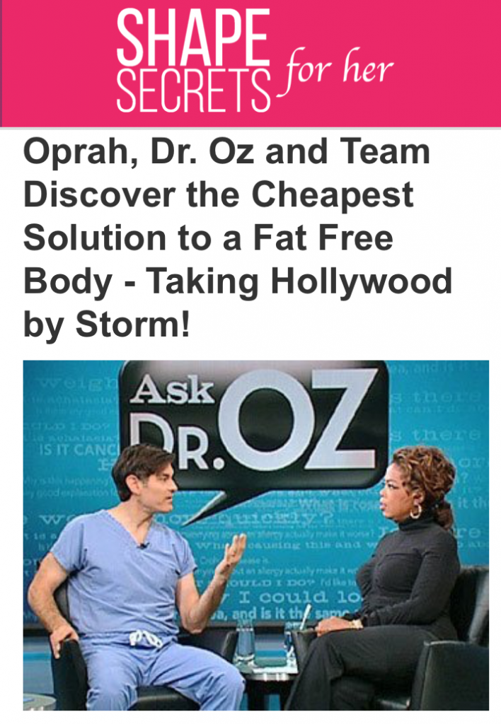
The page disappointed me. I don’t know who Dr. Oz is, Oprah looks like that because she’s a billionaire, and was I hunting for stomach fat reduction tips. I think I’m on the wrong page.
How do you think that headline could be improved (or the ad itself) to prevent message mismatch? Let me know in the comments.

In the above ad, I expect to see something about how a fortune 1000 company is crushing it on mobile. I may take away some insights to apply to KyLeads.
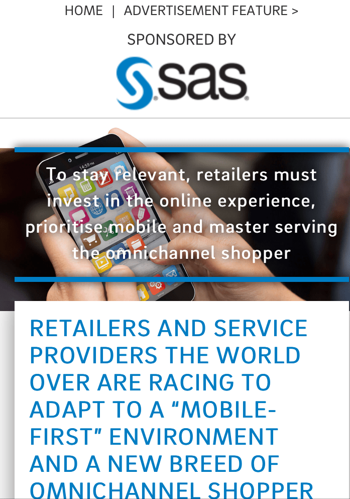
The only thing that lets me know I may be on the right page is the word mobile. Other than that, I can’t see anything about the companies who are crushing it. They’re also killing me with marketese. What is an omnichannel shopper?

In the above ad, they appeal to my greed. From the headline, I expect to get insider secrets most people don’t know about. The image leads me to believe I’ll learn about how I can unlock money (and the lifestyle that comes with it) using their process.

There are so many things wrong with the message match here. First, I don’t want to access global markets. I don’t know the first thing about trading. Where are the secrets that make it easy?
Second, the image of the lady I saw set me up for something very different. No one mentioned the five dollar investment either so why is it the most prominent thing on the page? The $375 doesn’t make me feel better. Even if you gave me a million dollars, I’d have no idea what to do next.
Why message match even matters
Every single person on the web is jaded. They’re tired of it all and have a healthy dose of skepticism. I can’t blame them. Some internet marketers are worse than this guy:

Although I couldn’t find a recent piece of research to support it, the common understanding is that we’re exposed to thousands of brand messages every day. Some estimates put it as high as 10,000.

Did you register all those ads?
No. The human brain can only process about 110 bits of information at any given moment. There’s a small chance someone will see your ad, post, or tweet. There’s an even smaller chance they’ll click on it.
Once they do, is it a good idea to scare them off with a page that fails to meet their expectations?
- The internet is a sleazy place
I’ll be the first to tell you I’ve been scammed on the internet. I’ve paid for software that promised to automate my life and deposit money in my bank account while I slept. It didn’t work.
I’ve purchased courses that promised to open my eyes to the secrets of traffic. I didn’t learn a single thing I’d call new.
I’ve hired people who’ve run with my money and I’ve been cheated by people who decided they didn’t want to pay for my honest work.
Small fortunes have been made – and lost – because folks have used the anonymity of the internet to prey on basic human drives.
Within the last decade or so, we’ve learned how to call bullshit with surprising accuracy.
- Cognitive Dissonance
As a member of humanity, you’ve got a lot of good things going for you. Chief of which is an opposable thumb – fancy way of saying we can hold stuff.
The second thing we have going for us is a mind that worries about more than food, sex, and shelter. We have beliefs, values, and hopes.
Cognitive dissonance is one of the things unique to humanity. It describes the mental stress someone feels when they to hold two or more contradictory beliefs, thoughts, or values.
The Cognitive Dissonance Theory states people will change their behavior or attitude to alleviate the stress caused by cognitive dissonance.
How does that affect your messages?
Your prospects click through to your page with certain beliefs. Those beliefs are a result of their life experiences and the promise you made.
For example, if you tell them about an all in one tool guaranteed to make them money, some won’t look at it twice. That’s because of the beliefs they’ve taken into the interaction.
Others will take it at face value and click through to your page. If you don’t reinforce your initial promise on your page, there will be cognitive dissonance. The behavior or attitude of your prospect will need to change to reduce the mental stress message mismatch is causing.
The easiest solution is to close your page and go about their day.
- The scent theory
We search for information on the web the same way other animals hunt for food.
According to scientists Ed Chi, Peter Pirolli, et al. from Xerox Palo Alto Research Center, people search the web from a central repository or hub like a search engine. They follow the trail which consists of hyperlinks, recommendations, images, and citations to get the needed information.
If the scent remains strong, the searcher will continue in that direction. As soon as the scent goes cold, they go back to the central hub and continue. This process is repeated as much as needed.
If your page showed promise, people will click on it. If the scent goes cold, they’ll bounce in a heartbeat.
What does this mean?
You need to keep the information scent on your pages strong. Your visitor needs to understand they’re in the right place by presenting confirmation ASAP.
How to get message match right
It all comes down to mastering the post click experience. The post click experience is more than what’s on your landing page. Everything after the click – the emails, the landing page, the sales page, and the product itself – are part of the post click experience.
Tone and headline
The first and most obvious elements of message match are the tone and headline. As soon as your visitor lands on the page, they need to see a similar headline to the one that brought them there.
You don’t need to repeat yourself verbatim. That’s detrimental in many situations. Instead, reinforce the message they’re expecting to see.
If they clicked on something about cheap hotels, use similar keywords and continue the conversation about cheap hotels.
Your tone also matters. You can’t switch from warm and playful in the copy that got them to click through then switch to cold and formal. What you say matters just as much as how you say it.
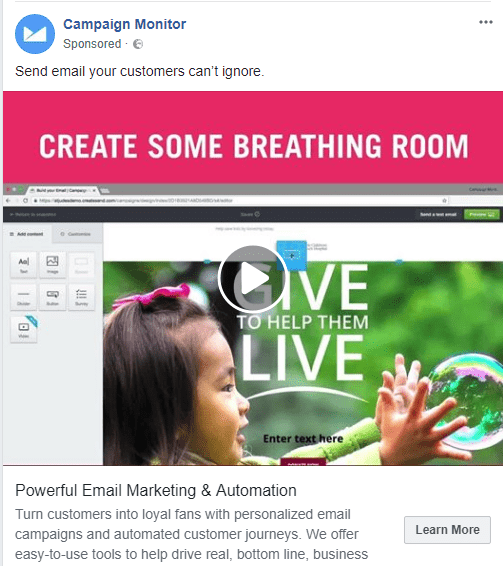
The above image is an ad from Campaign Monitor.
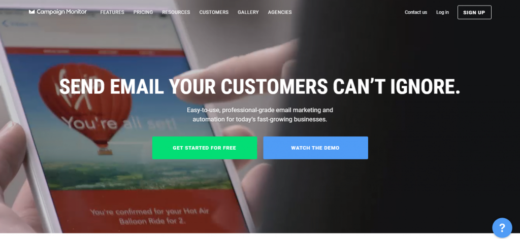
They’ve used the exact same headline to let their visitors know they’re in the right place. The subheadline continues by using similar keywords found in the ad copy.
Keep the wording and the way you put the words together similar on the ad and the landing page. That is all.
Brand colors
Colors are powerful cues.
For the purpose of message match, your colors need to stay consistent. Not every traffic generation device will incorporate visual cues. Google search results are a series of blue hyperlinks. Not much room for an image there.
When you do use an image, its color needs to be the same or similar to the ones you use on your landing pages. The safest bet, though not required, is to stick with your brand colors.
It won’t be a pleasant experience if they followed an ad that was red, landed on a page that incorporated that red, but the rest of your website is purple.
That’s a sure way of causing cognitive dissonance.
When in doubt, don’t do it.
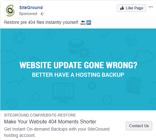
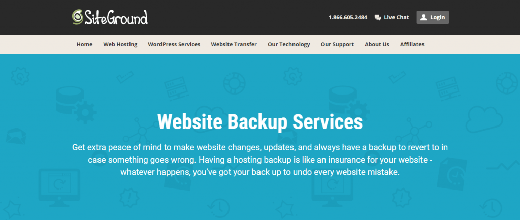
This ad and landing page from SiteGround maintain color consistency well.
Imagery
Imagery is another important aspect of message match. At KyLeads, we tend to use illustrations. That’s not just for blog posts like this one. We use them in our ads, social posts, and everything in between.
How would you feel if you clicked on something that lead with a huge illustration and landed on a page with a stock photo? You’d wonder if you were in the right place.
You can counter this with a strong headline that reinforces your promise, but why leave it to chance? Your visitor may or may not buy it.
Leave the uncertainty out of the equation. Either you don’t use a hero image on the ad or you use one that reinforces the imagery on the landing page.
Dialed in audience
This aspect of message match starts before you ever write a line of copy. In fact, you should’ve taken this into consideration when you thought up your business idea.
If you didn’t, don’t worry, you can still do wonders. The most important step is to understand who your ideal customer is.
How do you do that?
If you already have a few customers get on the phone with them *gasps.* That’s right, you have to talk to real live human beings.
Here are a few questions to get you started:
- What’s the hardest part of your day?
- What product do you wish you had that solves x problem that doesn’t exist yet?
- What task related to x take up the most time in your day?
- Is there anything that could be done to improve x (x being an outcome relevant to your solution)
- What are your biggest/most important personal goals?
- How important is x (x being the value you give) to you?
- How motivated are you to solve x (X being the problem)?
With all of these questions, ask them “why” and dig as deep as possible. Try not to lead them because your results will come out skewed.
You can use these questions on customers as well as potential customers. Your goal is to understand what they want. You can also pick out how they describe the problem in their own words and use that copy in your ads and landing pages.
Stop sending paid traffic to the homepage
Look, I know you’ve spent a lot of time and energy to get your homepage just right. It’s a good place for people to “stumble” on your brand.
I’m not arguing that fact.
What I’m arguing against is sending paid traffic to said homepage. Don’t do it. This irks me to no end. You spend the time and energy to make a campaign you’re sure will have a huge impact on your business. After the right creative is in place, mouthwatering copy is crafted, and the perfect call to action is implemented – you push send.
All that dialed in traffic hits your homepage and your results are mediocre at best.
Why?
Because your homepage is a general asset. It caters to different people at different stages of awareness. Your ads target people in specific situations – specific stages of awareness.
The homepage is general. The landing page is specific.
Here are a few more reasons:
- We’re easily distracted. Your homepage has a lot places and ways for the visitor to continue the interaction. Your desired action may or may not be taken.
- Short attention spans. Even if your visitor isn’t distracted by the shiny objects on your homepage, they still have a short attention span. You need to get to the point fast to keep them engaged.
- No tension. There’s no sense of “I want it now” on a homepage. Often, there’s not a sense of strong desire and the action that comes with that. Now, some are built like landing pages – is yours?
The right information needs to be there
Last on the list and the key to message match is placing the right information on the page. It’s the information your prospect expects to see when they’re reading your copy. We touched on information scent earlier in this post. People will bounce when they think they’re in the wrong place.
This comes into effect only after your headline has done its job.
If you’re selling boots and your ad led your visitor to the right page with relevant imagery, colors, and headline, you’ve won half the battle. The other half consists of the details. What do they need to know to take the next step?
When the relevant details to flesh out your promise are missing, only a few people will go looking for them. Most won’t contact support or “drop you a line.”
Can you relate?
When the information needed to make the final decision is missing – you’re losing money.
Think about what someone needs to know in order to take your desired action. If you’re selling an ebook for an email address then what does the visitor need to know?
- How long the eBook is
- What the main points are
- What they’ll take away and can apply in their life
- How much it’ll cost them (an email address)
- How long it’ll take to get it (as soon as they confirm their email)
It doesn’t have to take thousands of words to deliver this information. It also doesn’t need to be difficult. Just keep in mind what someone needs to know to take your desired action.
Let’s look at some message match excellence.
Finally, it’s time to look at the places where message match hits the spot. Keep in mind that we’re only looking at the message and the landing page – not the entire funnel.
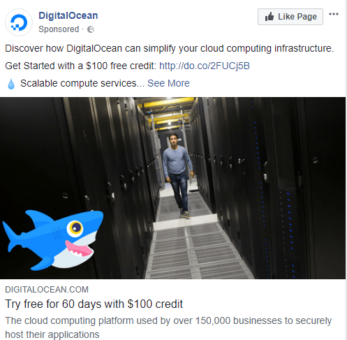
Above is the DigitalOcean ad that takes us to the landing page below.
The first thing that comes to mind is that they could’ve used better imagery. The ad image has nothing to do with what we see on the landing page.
What they got right is the headline and supporting text. They used similar words like “60 day trial” and “scalable” to reinforce the initial message.
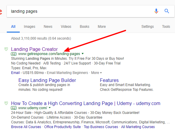
Above is a Google search ad that has no imagery so the advertiser needed to convey all their information with text.
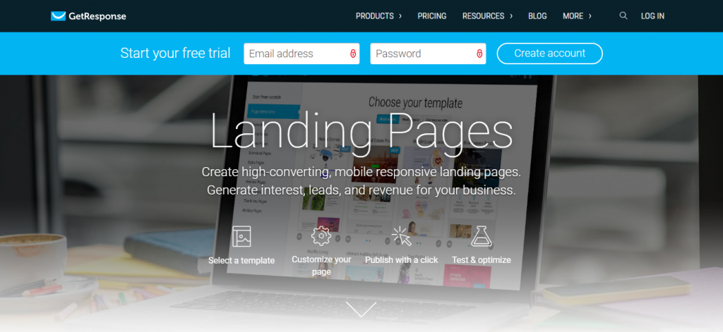
You can’t help but know you’re on the right page. The message match is clear. You’re looking for a page about landing pages and you’ve found it.
They could use a few more phrases from the ad to reinforce message match. Something tells me a lot of separate campaigns are driven to this page.
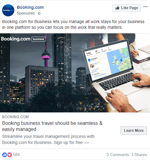
In the above ad, there’s no confusion about who they’re targeting. Let’s see if the landing page lives up to expectations.
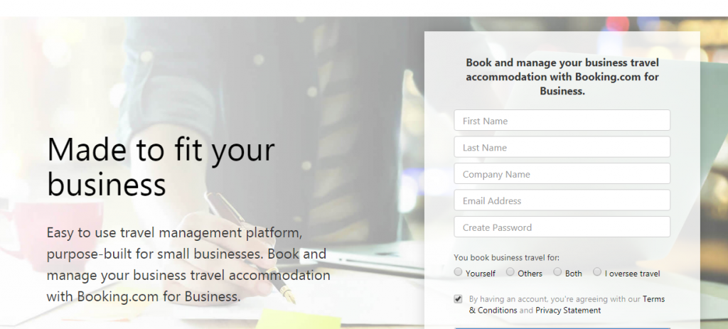
The ad follows through. There’s no doubt that you’re in the right place. They keep the flavor the same by using similar keywords in the main heading and the text above the form. The subheading also corresponds with the ad.
Conclusion
Message match is one of those things that’ll have a huge impact on how well your online marketing performs. When you get it wrong, all the best practices in the world won’t save you. When you get it right, you’ll feel like superman after taking a dip in the sun.
There’s no comparison between poor message match and great message match.
You don’t need to do too much to make it work for you. In other words, it’s not as difficult as it may seem.
- Keep your landing page headline and tone similar to the ad or post that brought them to your website.
- Maintain the same color palette.
- If you’re using images, make sure they’re the same style.
- Know who your audience is.
- Always make sure the next step is clear and the information needed to make a decision is available.
Share pages with killer message match in the comments or let us critique your campaigns in the comments.