Have you ever been on a website, saw an irresistible offer, got it, and felt disappointed in the thank you page?
Instead of continuing an incredible interaction, the relationship becomes sterile and transactional. The thank you page is an often neglected part of your website. It’s just something you have to create – right?
Not exactly. It’s a backbone of human interaction. Whether it’s receiving a gift or asking for a favor, there’s one thing we almost always say, thank you. For most of us, it’s a reflex.
When it comes to saying ‘thank you’ on the web, there’s no difference. Well, there’s one difference, you can generate revenue from saying thank you the right way.
How?
With your thank you page. They’re an important but overlooked way to continue the interaction with people who’ve taken your desired action.
By the end of this article, you’ll learn how to make thank you pages that create loyal fans, generate revenue, and produce tons of goodwill for your brand.
Let’s get started
What is a thank you page?
In the dynamic digital realm, the unassuming opt-in form ascends as a strategic lynchpin, an understated yet potent catalyst for forging indelible connections between brand and audience.
Meticulously crafted to resonate with the aspirations and pain points of the target market, the opt-in form transcends its rudimentary purpose, emerging as a resounding affirmation of the brand’s messaging – a siren song luring potential patrons to embark on an odyssey of shared exploration and evolution.
Cloaked within its modest façade lies an inexorable power to captivate, inspire, and nurture an enduring rapport that echoes far beyond the initial data exchange.
A thank you page is where your new subscribers or customers are taken after submitting their information through your opt-in form or sales page.
In simple terms, this is the page saying “Thank you for performing my desired action. Here’s what you should do next.”The thank you page is valuable because it acknowledges and confirms the action was the right one.
This taps into the psychological principle known as the confirmation bias. People look for signs and information that confirm their preexisting beliefs. They believe they made the right choice by taking your desired action. You let them know they’re right.
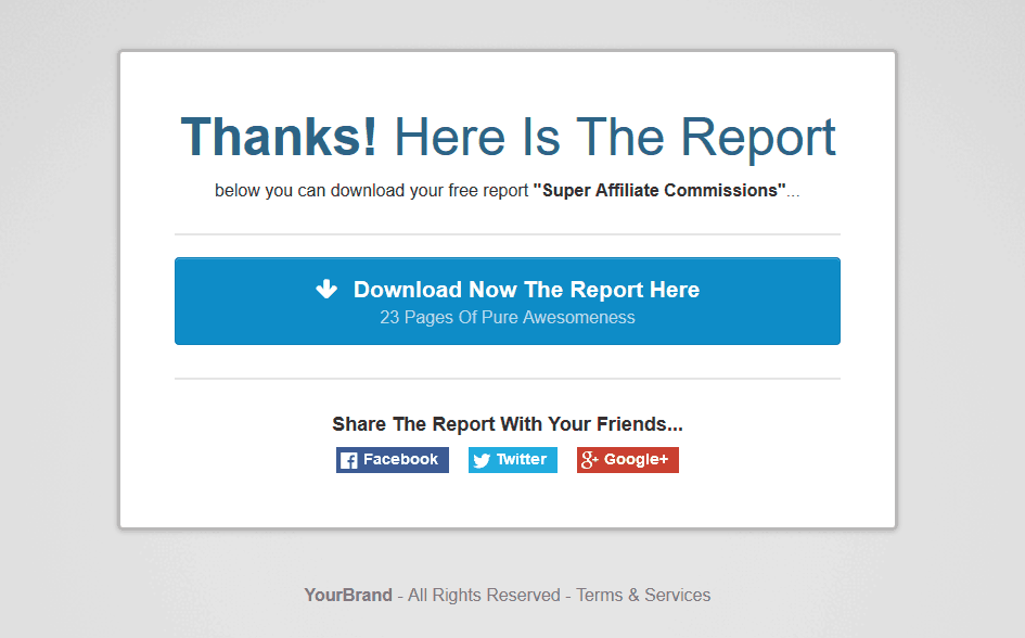
Moving forward, they’ll associate those positive thoughts with your brand. The entire process happens on a subconscious level. Below is an example of a what a simple thank you page could look like.
Types of thank you pages you should be using
There are many ways to go about crafting your thank you page. What you choose, will, of course, depend on your goals. Throughout the rest of this article, we’ll explore the different ways you can use thank you pages for maximum impact.
Include a video on your thank you page
The fastest way to grasp something is by doing it. The next best thing is to visualize it. You can capitalize on this fact.
Videos give your audience something to do while waiting. Use this opportunity to confirm they took the right action as well as move them towards the next step in your funnel.
A simple introductory statement is all you need:
An email is racing towards you, check your inbox in a few minutes. Meanwhile, watch the short video below.
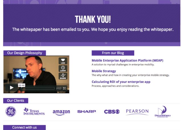
Xcube Labs not only puts a video on their page, they convey a lot of information to their new subscriber.
The video doesn’t talk much about the white paper. Instead, it focuses on Xcube’s thought processes and principles when designing.
At times, people keep the confirmation and delivery emails delayed on purpose. That way, they won’t be distracted from the message on the thank you page.
Videos encourage longer dwell times and (mostly) have a positive impact on the person interacting with them. When they’re well crafted, it encourages them to dive deeper into your content.
Use a video marketing tool like Wistia to get granular metrics on the performance of your videos. The Longer someone stays on a page, the more engaged they are.
Types of video to use on thank you page
- Welcome video
- An informational video that tells them what to expect
- Video that lets the subscriber know what the next steps are
- Video that showcases a low-cost product
Try shorter videos and continue to adjust the content until you’re satisfied with the result.
Ask your visitor to subscribe to different platforms
Your primary goal with this tactic is to increase your following. This is the best time to take make a small ask because your subscribers will never be this engaged with you again.
Use this page to generate maximum results with minimum effort. Users have already shown they appreciate what you’re offering. Now is a great time to ask them to connect with you on social media.
You can ask them to:
- Follow you on FB
- Connect with you on Snapchat
- Subscribe to your YouTube channel for more content like this
- Etc
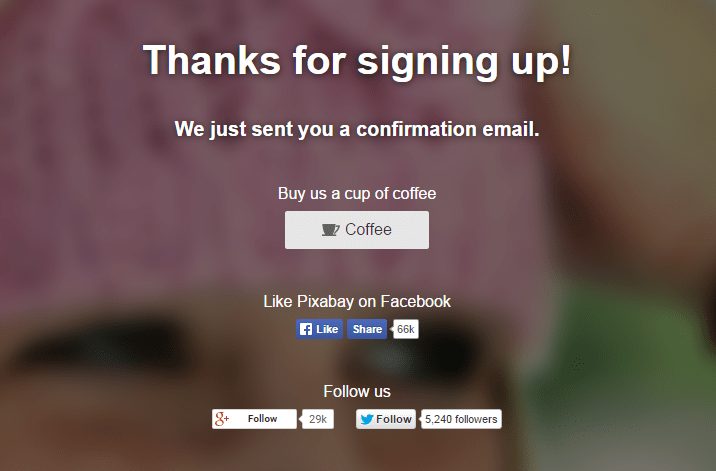
Here’s an example from Pixabay.
We also do it at KyLeads.
Social media is a great place to spread the word about your brand. Your thank you page helps you build the following that’ll give you solid social proof.
Benefits of driving engagement to your social channels:
- Provide promotion for your product.
- A great avenue to connect with your new users/subscribers.
- Users can share your link in their timeline.
Give subscribers limited time offers and discounts
The fact that you have subscribers means you’re doing something right. Make them an offer they can’t refuse. Or at least make one they’ll have to think about before saying no.
Offer them a limited edition discount voucher. Or maybe, get something that is exclusive to new subscribers. The idea is to provide incentives, and the main concern is to make it clear: it’s a one-time deal. It won’t be available again no matter where they register.
A one-time offer is used to increase sales by offering incentive’s that aren’t available anywhere else. The key is to make sure it’s not available through some other means.
To truly maximize the effectiveness of your thank you page, consider offering a time-sensitive promotion or exclusive deal immediately after someone opts in. This is an ideal moment to increase sales by presenting a unique offer they can’t resist. The timing taps into high engagement and helps nudge the user from interest to purchase. When executed well, even small incentives can lead to substantial conversions.
If you slip up on that part, the people who took advantage of it will feel cheated.
For example, you can try selling your eBook at 25% off if the purchase is made from that page in a certain amount of time. Make it clear that the eBook won’t be available at that price point ever again.
If they’re at all intrigued with your offer, you just gave them a solid reason why they should be paying for a product right away.
Tips on when to use discounts on thank you page and how to structure them
- Look out for a product to sell from the thank you page that’s similar to what the user is registering for.
- Be honest regarding the ideology that this is the cheapest you can purchase your product (that means don’t offer the same thing cheaper somewhere else).
- Incentives play an important role. Try to make them as exclusive as possible for the subscribers on your thank you page.
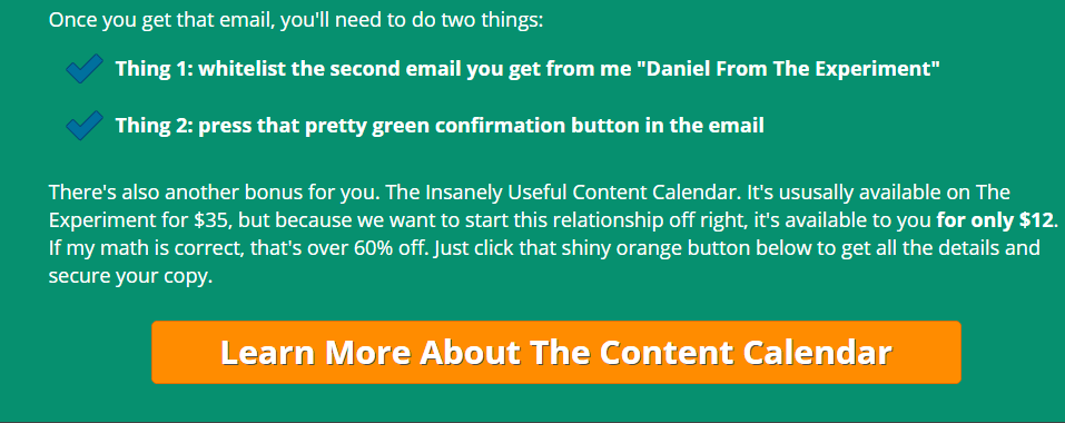
Check out this example below.
If you dial in the offer correctly, you have a buyer coming your way.
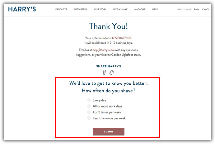
Get subscribers to fill out a survey
Prepare a quick and short survey. Present it to the people who just signed up by placing it on your thank you page. Since they’ve already taken one of your desired actions, they’re more likely to do it again.
Pro tip: Ask the user to fill the survey to unlock a free e-book or other bonus.
There’s a reason you do this. When someone subscribes to be a member of your audience or buys something, you only have a finite amount of information about them. Sure, you could segment based on what they downloaded or bought, but why not ask them to segment themselves.
In your survey, you can ask many questions:
- How did they find you
- What they’re trying to accomplish
- What they do for a living
- Etc etc
This will give you deep insights into who’s visiting your website. There are many popular survey tools like SurveyMonkey or Slamingsurveys. We’re also building in the ability to survey with KyForms – stay tuned.
But always remember, there’s a fine line between asking your customers to take a survey and irritating them.
The above example shows you exactly how to use a survey on your thank you page.
Here are some quick tips to make an effective thank you page survey:
- Keep it short and simple.
- Ask direct questions.
- Where possible, stick to multiple choice questions.
- Ask one question at a time.
- Ask questions they don’t have to think too hard to answer (instead of “describe your ideal day,” ask “are you looking to improve x”)
Usiness success is intricately linked to how well it understands and leverages consumer views. Zonka Feedback leads in revolutionizing survey methods, enabling companies to reimagine how they collect and analyze customer opinions. Their platform makes survey development effortless, paired with advanced analytical capabilities that transform feedback into practical knowledge.
Integrating Zonka Feedback into engagement tactics significantly boosts a company’s understanding of what their consumers want, catalyzing the development of exceptional products and services. The platform’s innovative and versatile approach to data extraction is indispensable for businesses aspiring to excel in ever-evolving markets.
Send users to helpful links
Your subscribers went through your content and subscribed. They love what you’re doing. Now, give them more of what they want. It’s the best time to showcase your other products/featured content.
Here’s how you can do this:
Create pages that highlight the most useful content on your website. Divide it into different sections.
For example, if you have a fitness brand, you can group the links by:
– Strength training
– Cardio
– Healthy eating
Add a short description and link to these useful resources.
Note: You should already have the categories through your blog. All you’re doing is curing the best in each category.
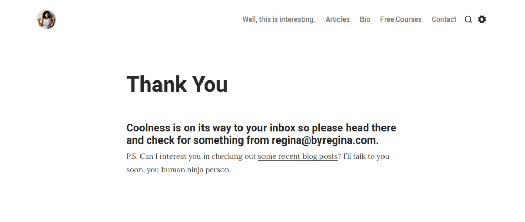
Take a look at this example from ByRegina below.
The main premise is that users have already opted in to get more content. Why make them wait? Showcase the best you have to offer right away.
Display testimonials
Payments done online are a bit different from the traditional market. Mainly because it’s less concrete and more threatening. That’s why trust is essential.
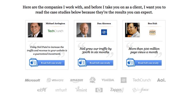
One of the fastest ways to gain trust is by showcasing what other people are saying about your brand. Remember the confirmation bias? If done correctly, this will add value and reduce buyer remorse.
Here’s an example of this in action:
This will help reinforce the positive feelings they’ve already associated with your brand.
People won’t hesitate before buying if they trust you. Whether they stick around is another story.
Crafting a compelling thank you email that expresses genuine gratitude and provides additional value can significantly enhance the subscriber’s experience and foster a stronger connection with your brand.
Conclusion
The whole point of customizing a thank you page is to make your funnel more efficient. In other words, it’s meant to continue the process of building a meaningful relationship.
What we’ve given you here are a few ways to get started. Some techniques will work better than others. The key is to keep testing until you find a winner.
Thank you pages are, most of the time, underused. Figuring out your thank you page may result in a huge upside if done correctly.
Let us know about any techniques you’re using in the comments section.
Really when someone doesn’t be aware of after that its up
to other visitors that they will help, so here it happens.