How It Works
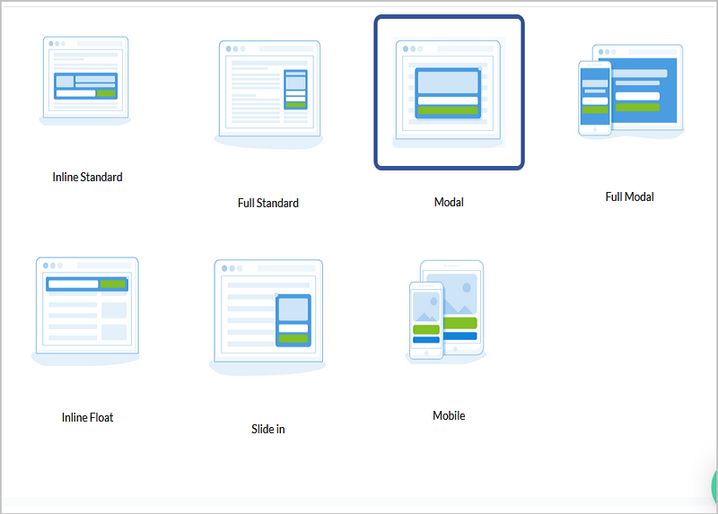
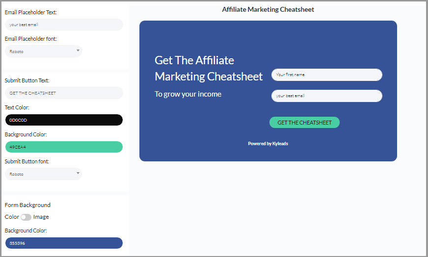
- Choose A template
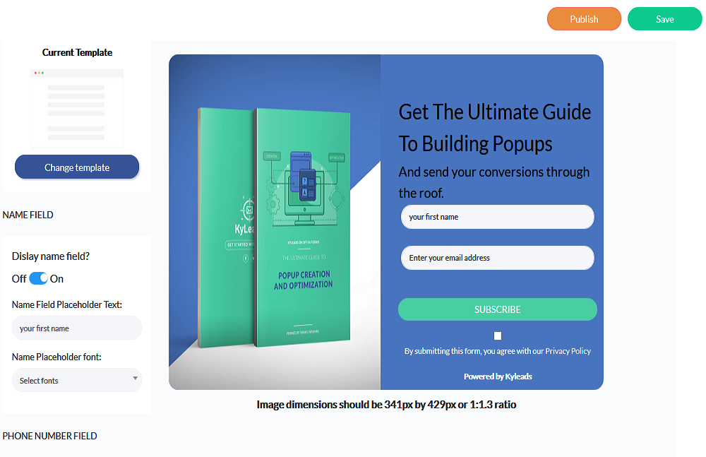
- customize
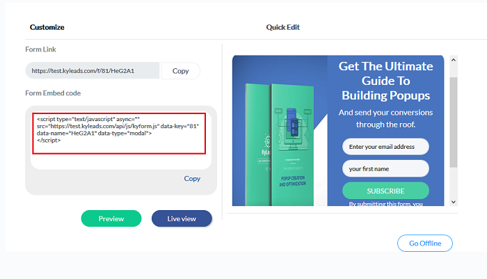
- embed anywhere

Choose When It Appears and Who Sees It

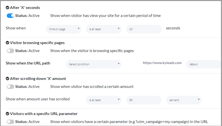
Page Level Targeting
Select the page targeting options for each popup. They can appear on a single page or multiple pages. Define certain URL paths I.E. yoursite.com/blog and they’ll only appear on pages containing that URL.
Create an enjoyable experience for your visitors and show them the most relevant offers.
TImed Display & Exit Popups
Choose exactly how long your popup will take to appear. Set it for just a few seconds or for a few minutes. The choice is yours.
Conversely, you can let them do their thing on your website. If they haven't subscribed byt the time they're ready to leave, show them an exit popup and convert the people who would've otherwise left.
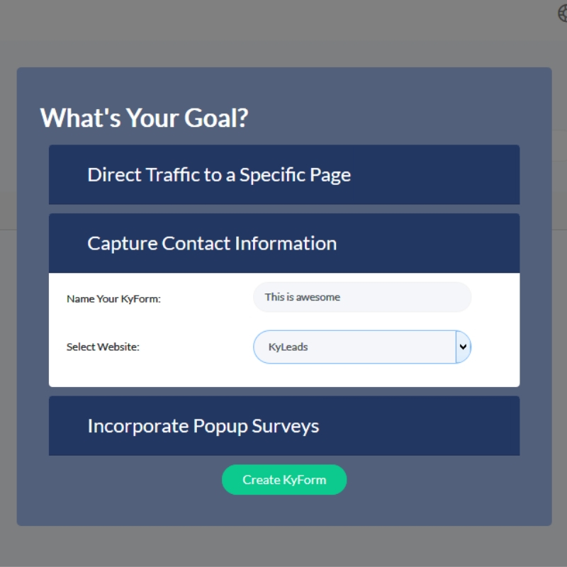
Drive traffic to another page
Not all popups need to capture contact inforamtion. Sometimes, you want to promote a launch, sale, or even a blog post. For that, we have popups designed to highlight your CTA and send your audience to your desired page. Learn more.

Multiple Display Types
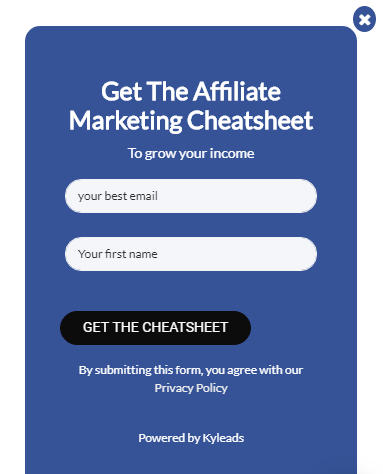
Popups
This is the original display type. It’s what the internet was built on. It’s also what gives pop ups a bad rep. The way they’re used makes us go meh. Our marketing team has been known to shed a few tears while browsing the web.
Install traditional popups on your website or mobile-only popups to turn your website visitors into subscribers so you can build lasting relationships, market to them over time, and add cold hard cash to your bottom line. Learn more ->
Slide-ins
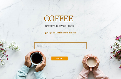
Imagine you’re knee deep in a great piece of content. They’re giving you all the goods. You’re interested, can’t wait to read the next line, and want it to go on forever. Then, suddenly, a popup appears and breaks your concentration.
Tell us you’ve never been in that situation.
Slide-ins are the perfect remedy. They deliver your message but don’t obscure the content which brought your visitors in the first place. The end result is more visitors become subscribers and eventually customers. Learn more ->
Inline Embeds
With the other types of opt-in forms, you’re interrupting your visitors. Sometimes that interruption is welcome, sometimes it’s not. There’s no way you can know. You’re not clairvoyant – are you?
We digress.
Place an opt-in form right in the content and allow your visitor to interact with it there.
Capture contact information without annoying your visitors so they’ll be willing to hear what you have to say over the long run.

Full Page Takeover
At other times, you throw caution to the winds to get the full attention of your visitor. It’s allowed. With the full page take over they either opt-in or die. Well, no, they won’t die but the Wolf of WallStreet was on the right path.
Put your message front and center so your visitors can surprise you at how much they resonate with it. Learn More ->

Floating Bar
The floating bar is the best of both worlds. It’s sticky and noticeable without impacting the browsing experience one bit. It hangs out at the top of the page and waits until it’s needed.
Use them to advertise a limited offer, contests, and even content upgrades. The flexibility of floating bars is only limited by your imagination. Learn more ->

Make It Your Own
Customize To Fit Your Brand
Your brand is unique. Everything from the colors you use to the way you talk to your customers is all your own. We have no intention of limiting your ability to express yourself. Change the fonts, colors, and imagery until you have a pixel perfect opt-in form that's a reflection of your brand.
Of Course, You Get To Test
Split Test All Your Forms
How do you know if that color is the right one? How do you know if the way you worded the offer will pull more subscribers? How do you know if the timing is right? Well, unless you can read minds, you don’t.
Make better data-backed decisions. Change any and all elements of your opt-in forms until you get offers that resonate, messages that stick, and conversions to die for.
Icing On The Cake
Success Redirect
Your new subscriber will never be as receptive to your messages as they are now. Make the most of this opportunity. Redirect new subscribers to a specific page that continues the conversation. Present a low-cost offer, tell them more about your brand, or give them an opportunity to feel special so you leave a lasting impression on them and ensure your next message is well received. Learn more ->
Actually Easy To Use
We know, everyone says that.
We’ve taken the time, energy, and resources to merge power with simplicity. There’s no point in having a tool that does everything if you can’t use it. With KyLeads, you’ll be creating your first form within minutes, not days so you can focus on growing your email list and business – not on learning new software.
Ready To Build Beautiful Opt-in Forms that Move Your Business Forward?
Copyright 2018 - 2020, KyLeads. All rights reserved.

