Exit popups have been proven to work well for increasing website conversion rates.
They can help you capture the attention of users who would otherwise exit your page without making a purchase or becoming email subscribers.
That’s never a fun experience.
It takes a lot of effort and energy to build an engaged mailing list that buys from you.
According to the experts, you need to create lead magnets that speak to your target market. I won’t get into the mistakes people make when they’re trying to create effective lead magnets.
I digress.
If you’ve built the perfect lead magnet for your audience, you may still be struggling to grow your mailing list as quickly as you’d like.
Why’s that?
There are a lot of factors that contribute to it but the lack of an effective exit intent popup may play an important role.
We’ve been quietly working on creating exit popups that will allow you to trigger different types of notifications based on visitor behavior.
I’ll walk you through what’s new in KyLeads and how our exit triggered popups work as well as how to make exit popups that convert visitors to subscribers.
Table of Contents
Exit popups in KyLeads
As I mentioned before, we’ve been quietly working on developing and testing our exit popup feature. The key with exit popups is to present a relevant offer when someone shows the intention of leaving the website.
A mistake people make is trying to show exit popups to everyone that lands on a page.
Why is this a problem? After all, you want to capture the visitors who would otherwise leave.
Yes, that’s the idea in theory but in practice, not all the people who visit your website are qualified. A lot of them get there by accident and will exit or press back immediately.
An exit popup won’t help you capture those contacts because they’re not right for your business anyways.
It’s important to filter out users who fall into that category.
KyLeads exit intent popups allow you to include a trigger option based on time in addition to triggering it based on leaving the current page.
Here’s how that’ll look in practice.
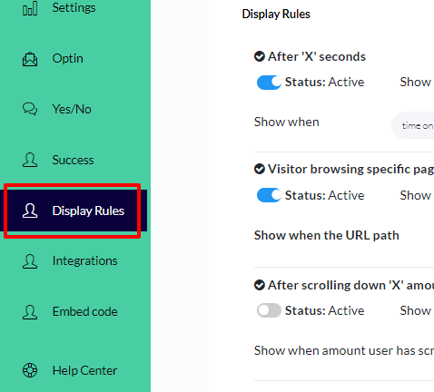
When you’re creating a popup form (either full screen or modal lightbox), navigate to the display options:

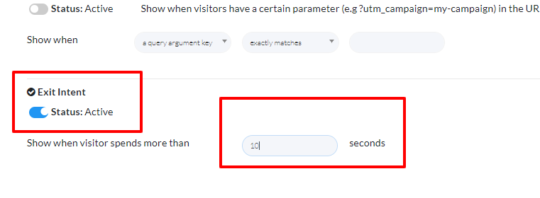
When the page loads, scroll down to the bottom and you’ll see the exit intent options. Toggle it on and set a minimum time delay before it can be shown to page visitors.

This will filter out the people who landed on the page accidentally or don’t find value in it. When you’re done, publish your popup and start collecting email subscribers.
Now, let’s look at what makes an exit intent popup and how to create effective ones for your website.
What Is an Exit Popup?
An exit popup is a display that comes up on the visitor’s screen when they attempt to leave a website.
A user could be on your page, and while viewing it, they might not find precisely what they’re looking for. Naturally, they’ll want to leave but while in the process of closing the tab or pressing the back button, an exit popup appears (either covering the whole page or a portion of the page) for the user to fill with their contact information.
Exit-intent popups give you one last opportunity to appeal to your visitors by detecting when the person is about to leave.
It might seem that popups are unnecessary because the visitor was already leaving your site. But, you know what they say, you lose all shots not taken.
No matter how you feel about exit popups, they’ve been proven to work well to increase the number of people becoming email subscribers.
Difference between exit popups and other types of popups
Popups appear in different ways. Some of them show up instantly on arrival on the page or when certain conditions such as time on page or scroll percentage are met.
Instant popups might seem like a great way to get customers involved, but in truth, it’s the direct opposite.
Most visitors immediately close the popup or simply leave the page – this is abandonment. It’s not fun.
When you visit a website, you’re usually in “look and see” mode. You could be shopping, anticipating an informative article, or something else entirely. If a popup appears immediately and conceals the content the visitor is looking for, they may get irritated.
Exit intent popups work a bit differently. They’re a response to the visitor’s desire to leave your website – their intent.
As mentioned before, it’s your last opportunity to engage with users before they bounce.
It doesn’t affect the user’s experience as much as other lead generation devices. Once the visitor decides to leave the page, they simply can. There’s no after effect.
As with other lead generation tools, it’s important to get the message right. If you don’t then you won’t see the gains associated with exit intent popups.
Strategies to create an effective exit popup for list building
1 – Exit popup discounts
Almost everyone loves a discount.
if you have an Ecommerce site it’s important to build a list of contacts that actually care about your products. An exit popup with a discount may be the key.
Why’s that?
Because it’s only someone that has an interest in your products and services that’ll decide to sign up for a discount.
Instead of the regular ”Subscribe Here” many websites use (I’ll never know why they do that), you can use “Get this 10% DISCOUNT off your first purchase” to only get the people with the greatest purchase intent.
Even if a purchase is not made due to other reasons, no harm is done, the visitors has filled in their details so then you can later promote other offers.

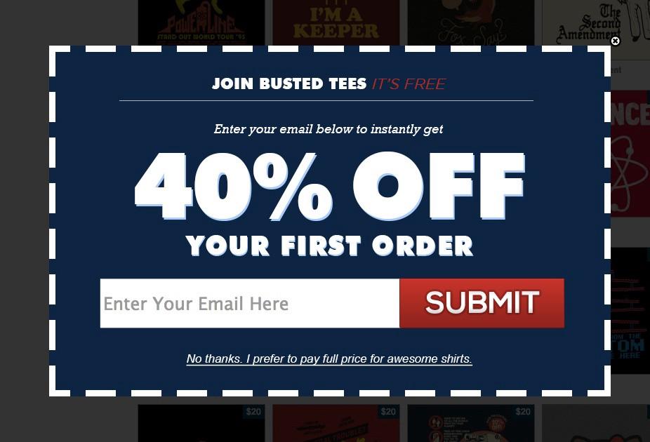
Busted Tees goes above and beyond by offering a full 40% discount to new customers. Either they have amazing margins or it’s a loss leader (loss leaders are also used on thank you pages).
These are even more effective when you create discounts for different categories of products on your website.
2 – Increasing the value of content
I’m sure you’re well aware of what a content upgrade is.
In a nutshell, they help your page visitor take the next step or make the current thing you’re talking about easier.
There are many ways to deliver an effective content upgrade and exit intent popups qualify.
They have the benefit of not interrupting your visitor while they’re deep in your article. At the same time, they make it possible to deliver the extra piece of the content puzzle.
If you choose the topic wisely then you’ll see a lot of people decide to sign up for it.

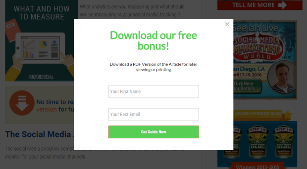
This is a clear example of using this strategy. It’s simply a PDF file of the article that the reader can get access to on-demand instead of coming back to the article every time they need to reference it.
3 – FREE TRIALS
Sometimes a visitor lands on your page and loves it but doesn’t know what the next best step to take is. This may be due to skimming or because there’s no clear CTA (fixing that is a topic for another day).
Either way, they’re going to leave before performing your desired action.
An exit popup providing a free trial for the product will make the visitor put out their information before using/downloading the product.
At the same time, you can use the exit popup to direct them to the free trial page where they can insert their information.
This also helps in a competitive market where there are more than 2 providers of such service/product eg Logic Pro and FLStudio or adobe and inkspace.
4 – Use attractive pictures in exit popups
They say an image speaks a thousand words. That’s just as true online. Choosing the right imagery for your exit popups is just as important as the message you use to entice visitors.
The aim here is to catch the eye of the visitor. You want a conspicuous exit popup to compel the visitor to take a second glance.
Consider putting an image that could cause a polite shock to the visitor, be creative with your image, and make sure it’s related to your page (or brand as a whole). Don’t go overboard with your image and make sure it is leading to that signup.
5 – Show your most sought after product
A new visitor might be on your page they saw on social media or any number of channels. Though curious, they may not be satisfied with what they’re seeing on your page.
Of course, they get ready to leave.
An exit popup that shows them one of your most popular products may just be the trick needed to get them to stay on the website longer.
It works effectively because instead of throwing all your products to the visitor at once, you present a product you know has the ability to convert people to customers.
CONCLUSION
Exit intent popups can improve conversions when used correctly. Exit popups fail to work for marketers/businesses for two essential reasons:
- They aren’t drawing enough to capture the visitor’s interest.
- Irrelevancy and insufficient value in the popup.
If you can steer clear of those mistakes, you’re well on your way to building an engaged mailing list.
How your exit popup appears can also impact conversion rates. Test different elements to figure out what works best.
I’ve only mentioned a few strategies to increase the efficacy of your exit popups and the list is by no means exhaustive.
Don’t be afraid to combine a few of these strategies together or come up with your own to make your popups even more effective. Let me know what you think in the comments and don’t forget to share.