In digital marketing, a good newsletter is an important part of your email marketing strategy. It helps you connect with your target audience, build relationships, and increase conversions. However, making a newsletter that really resonates takes careful planning and effort. This guide will help you learn how to design an effective newsletter that grabs your audience’s attention.
Table of Contents
Understanding the Importance of Newsletter Design
In the busy world of email marketing, a good-looking and well-organized newsletter can make a big difference. It can turn a campaign from okay to great. Just sending helpful content isn’t enough anymore. You must show it in a way that makes people want to open the email and connect with your message.
This is where good newsletter design is important. A carefully designed newsletter shows your brand identity and improves the user experience. Nice visuals, easy-to-read typography, and a clear layout can lead to more people opening your emails, clicking on links, and, ultimately, getting you a better return on investment for your email marketing efforts.
The Impact of Design on Open Rates
Think about this: you have worked really hard on your email campaign. You created great content, had a clear call to action, and built a good email list. But there is one key part that can change everything: the open rate.
But what is a good email open rate? According to GetResponse, industries like communications, nonprofits, and publishing boast the highest average open rates, while health and beauty, finance, and internet marketing typically see lower figures.
Industries with the highest email open rates are:
- Communications: 48.8%;
- Nonprofits: 39.71%;
- Publishing: 37.51%.
And those with the lowest email open rates are:
- Health and beauty: 27.73%;
- Financial services industry: 26.5%;
- Internet marketing: 21.9%.
This highlights the importance of benchmarking your email performance against industry peers. What’s considered a successful open rate in one field might be average or even poor in another.
That being said, the way your newsletter looks can greatly affect the open rates. If it looks messy or boring, subscribers might delete it right away without reading it. On the other hand, a well-designed newsletter with an interesting subject line can catch their eye and make them want to click.
So, taking time to improve your newsletter’s design is not only for looks. It is a smart way to boost your email campaign’s success. A good-looking newsletter shows professionalism, grabs attention, and helps get more open rates.
Why Design Can Make or Break Your Email Marketing Efforts
In email marketing, a poorly designed newsletter can hurt your efforts. It can make users unhappy, damage your brand image, and reduce your returns. A messy layout, hard-to-follow navigation, or off-topic content can cause potential customers to lose interest in your brand.
On the other hand, a good newsletter can boost your entire email marketing strategy. It helps create a positive user experience and makes a lasting impression on your audience. A nice-looking newsletter with easy calls to action, clear wording, and fitting images can lead to more engagement, greater brand loyalty, and higher sales.
So, think of your newsletter design as an important investment, not just an afterthought. When you focus on design, you build a strong way to communicate with your audience. This adds value and supports your overall marketing success.
Preparing to Design Your Newsletter
Before you start designing your newsletter, it is important to build a strong foundation. This means taking several important steps to prepare for a successful email campaign.
Begin by dividing your email list. This helps you send the right content to the right people. Next, think about what you want to achieve with your newsletter. Do you want to drive traffic, promote a product, or raise brand awareness? Also, consider using pre-designed newsletter templates. This will help make the design easier. Lastly, gather all the content you need before you start.
Essential Tools and Resources for Email Design
Navigating newsletter design can seem hard at first. But there are many free and easy tools that can help you. These tools make it simple to create nice-looking newsletters even if you don’t have much design experience.
Several popular platforms give you free newsletter templates and drag-and-drop features.
- Envato: This platform provides many customizable newsletter templates and unlimited creative assets;
- Mailchimp: In addition to email marketing, it offers easy design tools and ready-made templates for making professional newsletters;
- MailerLite: This platform is great for beginners. It has a simple drag-and-drop editor and many free templates to choose from.
You don’t need to be a design expert to create an interesting newsletter. Just use these user-friendly tools to make the process easier. This way, you can focus on creating valuable content.
Gathering Content: What You Need Before You Start
Effective newsletter design is more than just looking good. The content is the most important part of a successful campaign. Before you think about how it will look, collect all the content you need.
For PR campaigns, having clear and well-structured content ensures your message reaches the right audience.
This makes everything work better.
Think about what your target audience cares about. What would be helpful for them? You can include blog posts, articles, product updates, special offers, and company news. Make sure each piece of content fits with your marketing goals and meets the needs of your audience.
Collect relevant images, create attention-grabbing headlines, and write strong calls to action. By organizing your content from the start, you can focus on where to place each item in the design. This helps you make a newsletter that works well and leaves an impact.
The Step-by-Step Guide to Designing Your Newsletter
Now that you know the important parts, let’s go through a simple guide to make your newsletter. This includes picking the right template. You also need to create an interesting subject line, add visuals, and make sure it works well on phones.
Keep in mind that your newsletter should look good and show your brand identity. It should help readers do what you want them to do. To do this well, have a clear CTA button, short text, and an easy-to-use layout.
Step 1: Selecting the Right Template
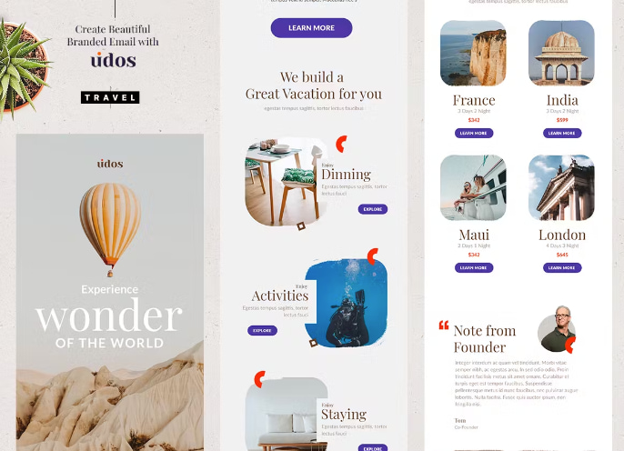
Choosing the right email newsletter template can streamline the design process and ensure a professional look. Many newsletter templates cater to different industries and purposes. Selecting one that aligns with your needs will provide a solid framework for showcasing your content effectively. Consider factors such as the number of content sections, image placement, and overall layout.
I’ve learned the hard way that not every email newsletter template is going to be your perfect match – it’s kind of like dating, you’ve got to try a few before you find “the one.” The game-changer for me was when I started testing different templates with small audience segments before going all-in. You’d be amazed at how a seemingly perfect email newsletter template might look great in preview but fall apart on certain email clients (I’m looking at you, Outlook).
Remember, simplicity is vital. A cluttered layout can overwhelm readers and detract from your message. Here’s a simple comparison table to guide your choice:
| Feature | Simple Template | Feature-Rich Template |
| Content Sections | 1-3 | 4+ |
| Image Placement | Minimal | Multiple |
| Layout | Single column | Multi-column |
| Best For | Focused message | Content-heavy newsletter |
Beginners may benefit from starting with a basic email newsletter template and gradually exploring more advanced options as they gain confidence in their design skills.
Step 2: Crafting an Engaging Subject Line
The subject line is the first thing your newsletter shows. It decides if people will open your email or ignore it. This line is very important in your email marketing strategy. It affects how many people open your email and how successful your campaign will be.
A good subject line should grab attention, create urgency, and show the value of opening the email. Use strong action words, try to personalize it, and keep it short. People scan their inboxes fast, so if your subject line is too long, it might get cut off.
Sephora’s approach demonstrates the power of data-driven marketing. Personalized subject lines create a sense of exclusivity and relevance, enticing customers to open emails and explore tailored product recommendations.
Try different styles, use emojis for fun, and add numbers to spark interest. The goal is to make a subject line that stands out in an inbox full of emails. This will encourage subscribers to check out your content.
Step 3: Incorporating Effective Visual Elements
Visual elements are important for capturing readers’ attention and breaking up long blocks of text, helping improve the overall user experience. Choose high-quality images that match your brand identity and message. Avoid using generic stock photos, as they can make your newsletter feel impersonal.
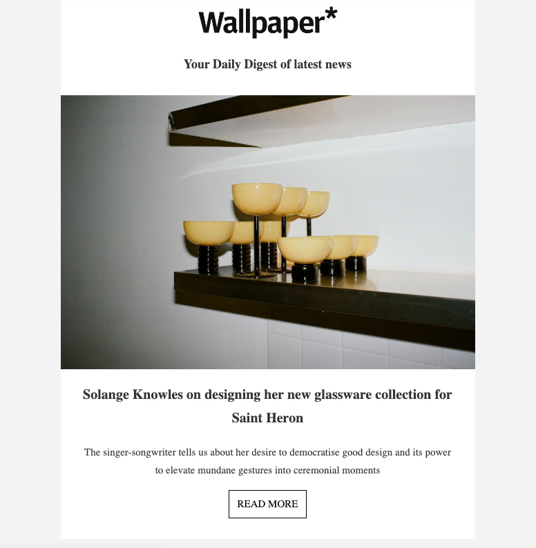
Wallpaper creates a strong brand identity and resonates with its sophisticated audience. The inclusion of such photos not only complements the written content but also inspires and engages readers, making the newsletter a desirable addition to inboxes.
Place visuals in smart ways to support your content and direct the reader’s focus. Infographics, icons, and custom graphics can also enhance the look of your newsletter.
However, it’s important to keep things simple. Don’t fill your newsletter with too many visuals. Aim for a balanced design that is both readable and works well with your content.
Step 4: Writing Compelling Email Copy
Compelling copy is key for a successful email marketing campaign. You can’t just share information—you have to connect with your target audience and inspire them to act. Keep your copy short and sweet. Use short paragraphs, bullet points, and subheadings to make it easy to read.
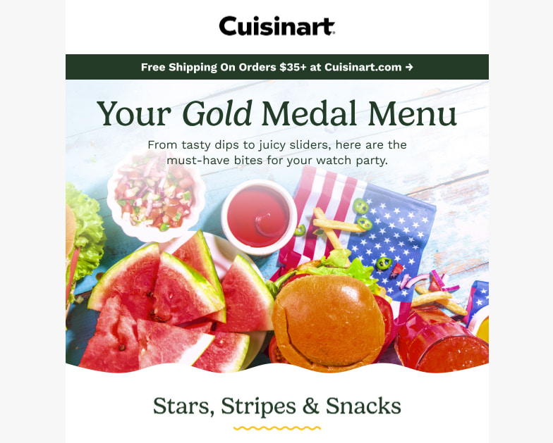
Cuisinart’s playful copy in its email campaigns creates a memorable and engaging experience for subscribers. This approach not only entertains readers but also positions Cuisinart as a relatable and approachable brand, building a loyal customer base that eagerly anticipates their next email.
Write in a friendly tone that speaks to your readers. Avoid tricky words or technical terms that might confuse them. Use strong action verbs, make it personal, and tell your audience what they can gain from your content.
Your newsletter copy should smoothly lead readers to your call to action. Each sentence should help your message flow and encourage subscribers to engage more with your brand.
Step 5: Designing Your Call to Action (CTA)
Crafting a strong call to action (CTA) is important for boosting conversions in your newsletter. Make your CTA stand out by using bright colors, interesting words, and placing it wisely. You can try A/B tests to find what works best. Personalize the CTA to connect with your target audience and match your brand identity. Make it easy for readers to take action by adding a clear and visible CTA button. Keep in mind that a good CTA can greatly improve the ROI of your email marketing.
Step 6: Ensuring Mobile-Friendliness
In today’s world, most people use their phones to check emails. Because of this, it is very important to make your newsletter easy to read on all devices. A newsletter that is hard to read will make users unhappy.
Make sure your design adjusts well to different screen sizes. Use a single-column layout so it looks good on mobile. Also, pick a font size that is easy to read on small screens. Test your newsletter on different email clients, like Gmail and Outlook. This way, you know it looks right on all platforms.
A mobile-friendly newsletter will make subscribers happy, no matter how they check their emails. By focusing on mobile design, you can give readers a smooth and pleasant experience and help your brand look great.
Enhancing Your Newsletter’s Appeal
Once you understand the basics, make your newsletter more attractive by using color and fonts wisely. These choices can greatly affect how much people engage with your content. They can also bring out feelings and help build a brand identity.
Picking the right fonts and colors can improve the look of your newsletter. They can also make it easier to read and help people remember your brand. Tools like a color picker can help you test different shades, stay consistent with your brand palette, and ensure your design looks professional.
Use these elements to create a newsletter that shares useful information and leaves a good impression.
Using Color Psychology to Boost Engagement
Color psychology is important. It helps to create feelings and affects how people act. When you use it wisely in your newsletter design, it can improve brand identity, make key messages stand out, and increase engagement. Knowing how different colors affect emotions can guide you in making a newsletter that connects well with your subscribers.
For example, blue can show trust and reliability, making it a good choice for banks or healthcare groups. Green brings a sense of peace and growth, working well for eco-friendly or wellness brands. Pick colors that match your brand values and the message you want to send.
Being consistent is key. Keep the color scheme the same in all your newsletter templates. This helps people recognize your brand easily.
After spending years in design, I can tell you that the color wheel isn’t just some fancy tool – it’s like a roadmap to creating newsletters that actually work. You’ll be amazed at how much more polished your designs look when you grab colors that sit next to each other on the wheel (we call these analogous colors in the biz, but don’t let the fancy term scare you).
And here’s a pro tip I learned the hard way: when you’re stuck, just glance at the color wheel and pick two colors opposite each other – it’s basically foolproof for creating eye-catching contrasts that still look totally pro.
The Role of Typography in Reader Engagement
Typography is very important for keeping readers interested and making your newsletter easy to read. Choosing the right font can improve your message, spark feelings, and show off your brand’s style. Use a clear font that is easy on the eyes.
For body text, it’s best to use sans-serif fonts like Arial or Helvetica, as they are more readable on screens. For headings and subheadings, a serif font like Georgia or Times New Roman can add some elegance. Stay away from fancy fonts that are hard to read.
Choose a comfortable font size. If the size is too small, it can hurt the reader’s eyes, and if it’s too big, it can break the flow of the text. Aim for a size that strikes a good balance and makes reading enjoyable.
Best Practices for Newsletter Layout and Structure
A good newsletter layout is very important. It helps readers understand your content and remember your key messages. A simple design, good use of white space, and a clear flow make it easier to read. This also encourages people to engage more with your content.
Follow these best practices: keep headings, subheadings, and body text in a clear order to guide the reader’s eyes. Highlight key information with bullet points, bold text, or pull quotes to grab their attention. Using a grid-based layout can help organize your content and make it look good.
How to Organize Your Content for Maximum Impact
Strategic organization of content is key to making your newsletter effective and keeping your subscribers interested. When you present your content clearly and logically, readers feel calm and are more likely to absorb your important points.
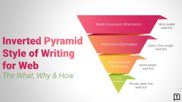
Use the inverted pyramid style to present the most important information first. This means essential details come first. This technique helps subscribers who quickly scan their emails, making sure they get the main idea of what you’re saying.
Use clear headings and subheadings to break up the text and help readers move through your message easily. You might want to add visuals, like images or icons, to split different sections and make them more appealing. A well-structured newsletter is easier to read and raises the chances that your subscribers will connect with your content. Keep in mind that a messy and unclear newsletter can cause subscribers to lose interest and miss out on important information.
Keeping Your Design Clean and Accessible
A clean design is very important in email marketing. It affects how easy it is for people to read and enjoy your newsletter. A messy newsletter with too many things can make it hard to focus and lead to a bad reading experience.
When you create your newsletter, keep it simple and clear. Use enough white space, which helps your content stand out. Make sure your images, fonts, and colors support your message without diminishing it.
Also, think about everyone who will read your design, including people with disabilities. Use colors that are easy to see for those with vision issues. Add alt text for your images to help those using screen readers. A clean and easy-to-use design looks nice and shows you care about being inclusive.
Wrapping Up
In conclusion, learning how to design a newsletter is key to getting your audience’s attention and increasing open rates. A good newsletter can have a big effect on your email marketing efforts. By choosing the right template and writing interesting content, you can create newsletters that your readers will enjoy. Using colors and different fonts can make your newsletter even more engaging. It’s important to arrange content for the best effect and keep your design simple. To improve your design, use analytics to see how well it works. Also, stay up-to-date on the latest email trends and tools to make your newsletter better.
Frequently Asked Questions
What are the best free tools for newsletter design?
Platforms like Envato, Mailchimp, Canva, and MailerLite offer free tools and newsletter templates, making it easy to create a great email newsletter. You can start with their default templates and change them as you like.
How often should I redesign my newsletter?
The good news is that there are no hard rules. Consider redesigning if your brand looks different or if you see less engagement. Use b tests to see what your target audience likes and adjust as needed. It’s fine if your newsletter design doesn’t take much time or require many changes.
Can I use templates or should I design from scratch?
Using templates is a good way to get started fast. You can change them to fit your brand, like adding your email signature, and including personal touches. If you know how to code, you can create designs from scratch. However, templates provide a simple and useful way to begin.
How do I know if my newsletter design is effective?
An effective design leads to engagement. You should track your open rates, click-through rates, and conversions. This is important, especially on your landing page. This will help you see what works for your prospective customers. Also, try B tests with different designs. These tests can help you find what is best for your audience.
Leveraging Analytics to Refine Your Newsletter Design
Using analytics is important for improving your email campaign. Keep an eye on important numbers like open rates and click-through rates. This helps you see what your subscribers care about. Use this information to adjust your design, boost engagement, and get a better ROI.


