An effective site search function on an e-commerce site has a number of potential benefits. Customers are accustomed to finding results quickly and (mainly) accurately from search engines, and will expect a similar experience on e-commerce sites.
On e-commerce sites, up to 30% of visitors will use the site search box, and each of these users is showing a possible intent to purchase by entering product names or codes.
Here are some tips and examples showing best practice in search box placement and design…
Why do retailers need site search?
- Improved sales. Effective site search means better usability, so customers can find things more quickly. This can translate into higher sales, as customers who find what they are looking for easily are more likely to make a purchase, while site search also offers opportunities for merchandising;
- Higher conversion rates. More intuitive search and navigation means higher conversion rates;
- Increased site usage. A better user experience means that customers are more likely to spend more time on the site, and can boost the number of registrations and return visits;
- Improved customer retention and loyalty . More loyalty as customers know they can find products more easily;
- Improved branding . Improving user experience means more customer satisfaction, and a better customer journey compared to competitor websites.
Site search best practices
Offer a site search function
“What incredible insight” you’re thinking, but you’d be amazed that some big name e-commerce sites don’t actually offer this.
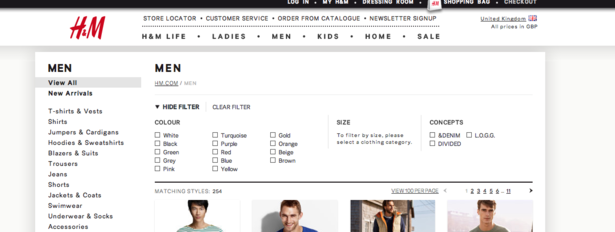
The following sites have no site search at all, which is bonkers.
H&M:
At least it has some decent filtering options…
Gap:
No site search box, and the top nav is so subtle it’s easily missed. I wonder how people find anything.
Position of search boxes
Navigation, including site search boxes, should be visible across the entire site, so that visitors can move around easily, whichever page they happen to arrive at.
Retailers should place the site search box in a prominent position on the page so visitors can find it easily.
Most e-commerce sites place the search box near the top of the page, above the main navigation bar, as in the example below from Best Buy.
As this is where visitors will expect to find the search box, it makes sense to place it somewhere at the top of the page.
According to Depesh Mandalia, Head of Conversion & Product at ticket.com:
There is a standard for search boxes to be placed in the top right of websites. Creating familiarity here speeds up the shop and reduces customer thinking time. Keep it simple and easy to find.
Make it easy to find
It needn’t be the most visible item on the page, but users should be able to find it quickly when they arrive at a page and scan around. Different positions should be tested to find which generates the most queries.
On these examples from John Lewis and Net A Porter, the search box blends in to the page, and is harder to spot as a result.
John Lewis:
Net A Porter:
Position the search box away from other boxes
Don’t confuse customers by placing it too near other boxes, such as newsletter sign-ups or postcode searches for stock info.
Labelling of the search box
It should be obvious what the search box does, so label it clearly.
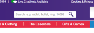
The use of colour to label Play.com’s site search makes it more likely to attract the visitor’s attention, and also doubles as a useful call to action.
However, using the word ‘search’ instead of ‘go’ may may the purpose even clearer.
Another option is to use the magnifying glass icon, which is becoming commonplace on e-commerce sites.
Text in the site search box
The text within the box can be used to explain the function of site search to customers.
For example, the text in the Tesco search box tells customers that they can search for products by keyword, or by product code from a catalogue, or even enter a location to find details of their nearest store.
Make the text disappear
Retailers should also use JavaScript to ensure that the default text in the box disappears as users click to enter their own search term. Don’t force them to delete the text before they can begin, as this is incredibly annoying.
Let people search using the enter key
This is much easier than having to move the cursor and click the ‘search’ button.
Size of site search box
This is an area that is worth testing, and the size required will depend on the type of products sold on the site and customer search behaviour.
If customers are entering search terms of two or more words then the box should be large enough so that users can see the whole term they are entering.
This means that users can correct any errors and misspellings if they need to, as they can see the search term in full.
Amazon uses a search box which is large enough to deal with lengthy queries, such as the make, model and serial number of an electrical product.
Place a site search box on each page of the site
Having a search box on each page makes it easy for customers to get back to a product search from any point, and also provides an alternative method of navigation for users that arrive at product pages.
However, placing a site search box within the checkout process can provide a distraction for customers when they should be concentrating on making a purchase, so this is one area that doesn’t need one.
Allow users to narrow searches before they begin
Tesco provides a drop-down menu so that customers can limit the scope of their search to one section of the site.
This instantly avoids returning lots of results that are irrelevant for the user, as well as making it more likely that they will find what they are looking for. A useful feature for sites with a large number of SKUs.
Use auto-complete
Some retailers use an auto-complete tool which begins to offer suggestions when users have entered a few characters into the search box.
This has a number of advantages: it speeds up the search process for users, it helps them to avoid misspellings, and it also ensures that customers’ searches will return a product result.
According to Matthew Curry, E-commerce manager at Lovehoney:
In my experience, autosuggest provides a real boost to search conversion rates. In a usability test I ran, we found that users actually relied upon site search autosuggest and autocorrect to know the correct spelling of words for them. Make sure that your site search solution is up to scratch, and that you still provide search results for common misspellings, just in case.
In this example from Waterstones, shoppers who can’t remember the spelling of a famous Russian author’s name only need to get the first four or five letters right.
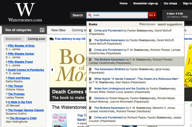
The same principle applies for travel sites, where users may be unsure of the spellings of some results. Well-implemented auto-complete can save customers a lot of effort, and speed up the search process.
Link to advanced search options
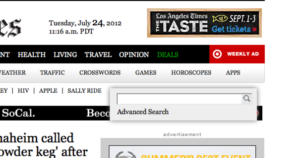
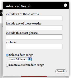
The LA Times links to advanced search options as soon as you begin to type in a query. (HT: SLI blog for the example).
Since the newspaper has a lot of content, it makes sense to allow the user to search in more detail.
In the next post in this series, I’ll look at site search results pages, and the kinds of features and options users would expect to see there. Meanwhile, please let me know if I’ve missed any essential tips here…
