How to Build a High Converting Landing Page From Scratch
By Jamie Ashley
Effective landing pages are important for many reasons. The most important one?
They convert.
It can’t just be about whether it looks good, or if it makes your company look eco-friendly – it’s about whether it will turn visitors into leads, and eventually customers.
And it’s not as difficult as it may seem.
This step-by-step guide will show you how to choose what content to include, how to design the page, and optimize it over time to maximize your conversions.
By the end, you will have a solid blueprint for building a high-converting landing page from scratch.
What is a Landing Page?
A landing page is a page on your website that’s designed to get visitors to take your desired action. That may be to turn them into leads, download an app, or even buy a product.
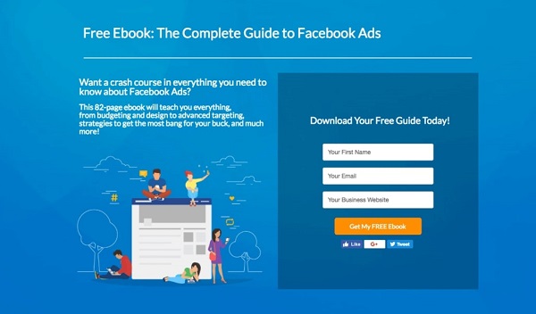
Credit: SPINX Digital
When you building an ad campaign or growing an email list, it is often ineffective to direct your audience straight to your products.
Instead, you utilize a landing page that showcases relevant information to entice your audience and promotes a specific action.
This could range from:
- Buying your product
- Signing up to your email list
- Subscribing to your social media channels
- Giving you a phone call
Essentially, it is the middle point between your promotional campaigns and the final product you want your audience to see.
Of course, for your workflow, it is essential that this page is highly converting and effective.
How can you do this though?
5 Steps to Building A High Converting Landing Page
Companies with 30 or more landing pages generate 7 times more leads than those with fewer than 10 – therefore it’s important to be able to build multiple pages.
Even more so, 40% cite their conversion rate as less than 0.5% - which is short of the typical 1-3%.
Why?
There are many reasons such as message match and other website optimizations but many times it’s because they’re not built properly.
Market Research
It is vital to understand your audience – and the reason why they are spending their time on your website.
Let’s say you are in the fitness niche and have videos about how to lose weight by changing your diet. If you’ve created an ad campaign and want to generate leads from your landing page, you would talk about diet, not about core exercise regimes.
This is because solving your audience’s problem with a direct answer is far more effective than offering a solution they might not want.
Yes: ‘Worried about what you are eating, and unsure about how a different diet can change your body? Click here for 10 recipes…’
No: ‘Fitness is easy, as long as you know the right exercises. Click here to learn more…’
The first is specific and relevant, whilst the second isn’t what they clicked onto your page for.
Ensure your landing page is targeting a specific audience, and you answer their needs within your message.
Highlighting real-world examples, such as Wellness Wag, showcases how companies can strategically build trust by using genuine client testimonials and prominently displaying relevant certifications.
By incorporating these credibility boosters, Wellness Wag effectively connects with pet owners, reassuring them of the company's reliability and expertise, which ultimately enhances engagement and boosts conversion rates.
If you are unsure about what your audience might want, mining reviews is a great way to find out.
By this, I mean navigating to sites such as Amazon and finding products related to your niche. Keeping to the example, you may look for a low-calorie cooking book.
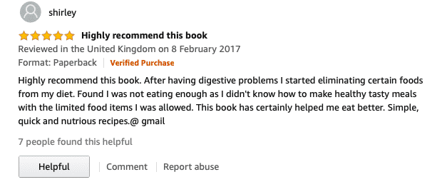
By looking at the reviews, you can begin to understand what the customer base liked, didn’t like, want to learn more about, etc.
Another way is through visiting online communities such as Reddit or Quora. You will be able to find questions that people are asking – and answers - for almost every niche.
Go through multiple threads and posts, to understand the most important problems and address them within your landing page.
If you have your own audience such as a large Facebook or Instagram following, you can poll them and ask questions. These insights can inform what you focus on when creating your landing pages.
Remember, a landing page is only effective if it draws in the audience by solving their problem, and you offer a solution to it.
Create A Compelling CTA
One of the most important features of a landing page is the call to action.
What do you want the user to do after going to your page?
This could be completing the checkout process, signing up for your email list, etc.
Consider what would have the largest positive business impact for you over the long-term.
Rather than directing your audience to a buy now button, an email list sign-up may be more productive.
This would allow you to build a relationship over time, pitch products on a regular basis, and increase your chances of converting them to customers.
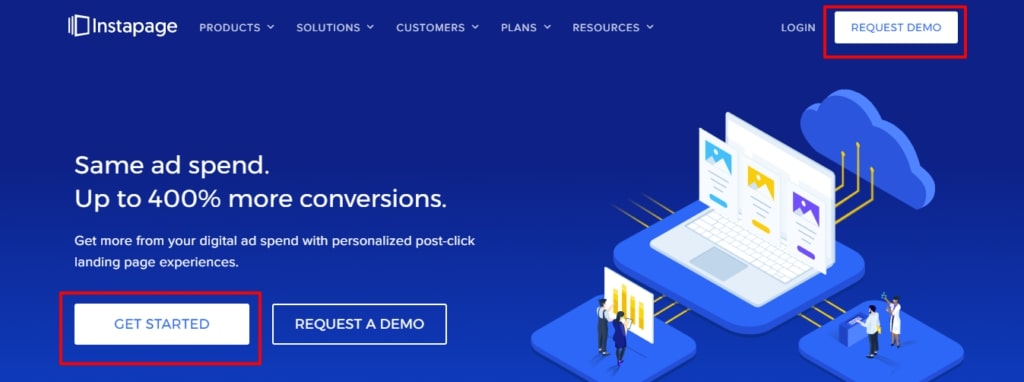
You also have to make sure that your call to action is the center of focus in your design.
The example below illustrates how to position your CTA for maximum conversions.
Credit: Capturly
The color of the CTA button is important and should contrast with its background (in this case white works well against the blue background).
In fact, Matthew Woodward found that by switching the color of his CTA from green to red, he increased his conversion rate by over 10%.
Don’t forget about the text you use for your CTA.
In this case ‘GET STARTED’ is effective because it is concise, delivers a simple message, and is action-oriented.
However, it could be improved by using incentivizing words such as ‘free’ or ‘free trial’, or by adding a benefit such as ‘Get Started and Begin Boosting Your Conversions Now’
Choose Your Tools
This part is simple – what tools are you going to use to build your landing page?
Should you create a new page on WordPress and direct them there?
It wouldn’t be very customizable or particularly design-friendly. I’d recommend against it.
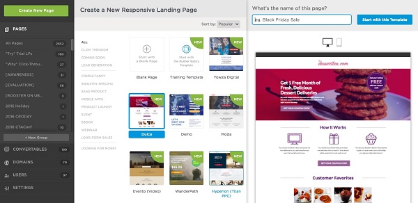
The better choice is going for a specific landing page builder like Unbounce.
Credit: GetApp
It offers great customization abilities with a drag-and-drop editor with many different elements and form types to choose from.
It also offers advanced features to help you improve your conversion rates such as deep analytics, A/B testing, responsive design on all platforms, and more.
Both LeadPages and Instapage are also good landing page builder alternatives. You can view a breakdown of the best landing page builders in this guide.
The most essential things to consider when choosing your landing page builder include:
- Ease of use
- Pricing
- Feature set
- Support
- Templates
- Integrations
After choosing what tool to use to build your page, it is also important to have your email marketing service lined up. If your CTA isn’t a purchase button, how you are capturing and managing the leads your landing page delivers.
Integrating an email marketing service with your landing page builder is the perfect way to do so - and allow you to continue to push products or services towards that audience.
You can find even alternatives to tools like Kajabi here.
Design Your Landing Page
Headlines
This is where your audience’s attention will go first. It has to be compelling and interest them enough to bother staying around.
Make sure your message, which we talked about at the start, is successfully communicated.
This can be achieved by using power adjectives such as ‘explosive’ or ‘supercharged’ – they emphasize the reader will get something tangible from it.
Another aspect to consider is personalizing it by addressing the reader directly and trying to answer the questions they have (which we have found out from market research).
Of course, make sure the headline remains credible and clear at all times, and try invoking curiosity or emotion to draw them in.
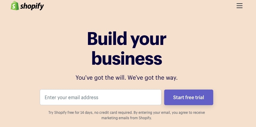
For example, Shopify here has used the concise headline ‘Build your business’ focusing on the word ‘build’ which is dramatic in nature. In the subheading, ‘you’ and ‘we’ create an instant relationship between them and the customer.
If you are still unsure try something along these lines:
Learn to [Do Something] like [World-class example]!
Learn to do social media marketing like Gary Vaynerchuck!
Or
[Do Something] the Best Way – We’ll Show You How!
Convert Your Customers The Best Way - We’ll Show You How!
Visual Elements
Most people don’t bother reading a block of text, and it’s the same with landing pages.
Remember, the point is to grab your prospect’s attention and try to convert them by directing them to your desired action.
Videos and images help clarify information, showcase your product or service, and even improve conversions by up to 86%.
SproutSocial does this well.
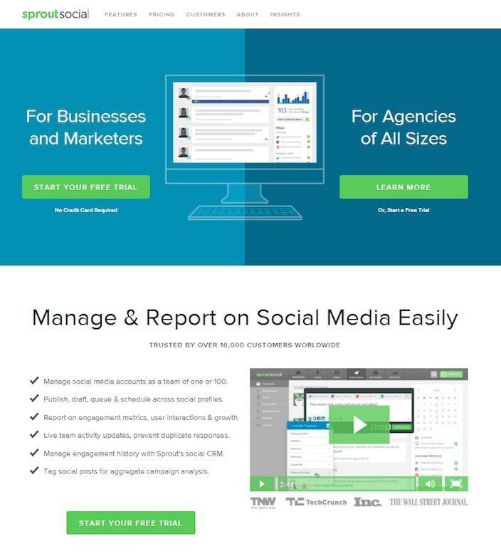
It offers a video for the audience to click and watch in order to receive an overall impression of the product.
If instead, they had offered a poorly put together video, their credibility would have substantially diminished.
They also strategically display their product through the use of screenshots and brief clips – focusing on what a free trial would offer.
It could have improved the page by adding clips of members of the team describing the product or real-life testimonials in order to boost the conversion rate.
When viewing a page, people often follow the F-pattern layout which is essentially the general way someone’s eye moves to read the content.
To maximize this, make sure to put your video or most important image nearer to the top left of the page.
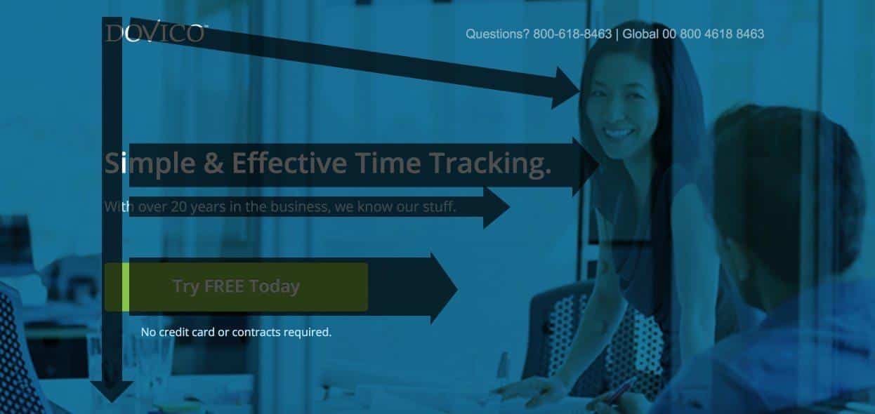
Credit: Dovico. An example of this in action on a landing page.
Relevant Information
Of course, within your landing page, you would want text to explain what you are offering.
I would normally split this with a headline, a quick explanation above the fold (if possible), and a longer explanation after scrolling down a bit.
However, make sure that this information is concise and straight to the point – the scroll length should ideally not be too long, as on average 66% of time is spent scrolling (and not looking at your content).
Scroll length can be reduced by making your information easier to read – through the use of bullet points for example.
Under your headings, justify or explain your features in 3-5 simple bullet points – that would be far more effective than a block of text.
This ensures you’ve clearly explained what you’re offering while boosting your conversion rate.
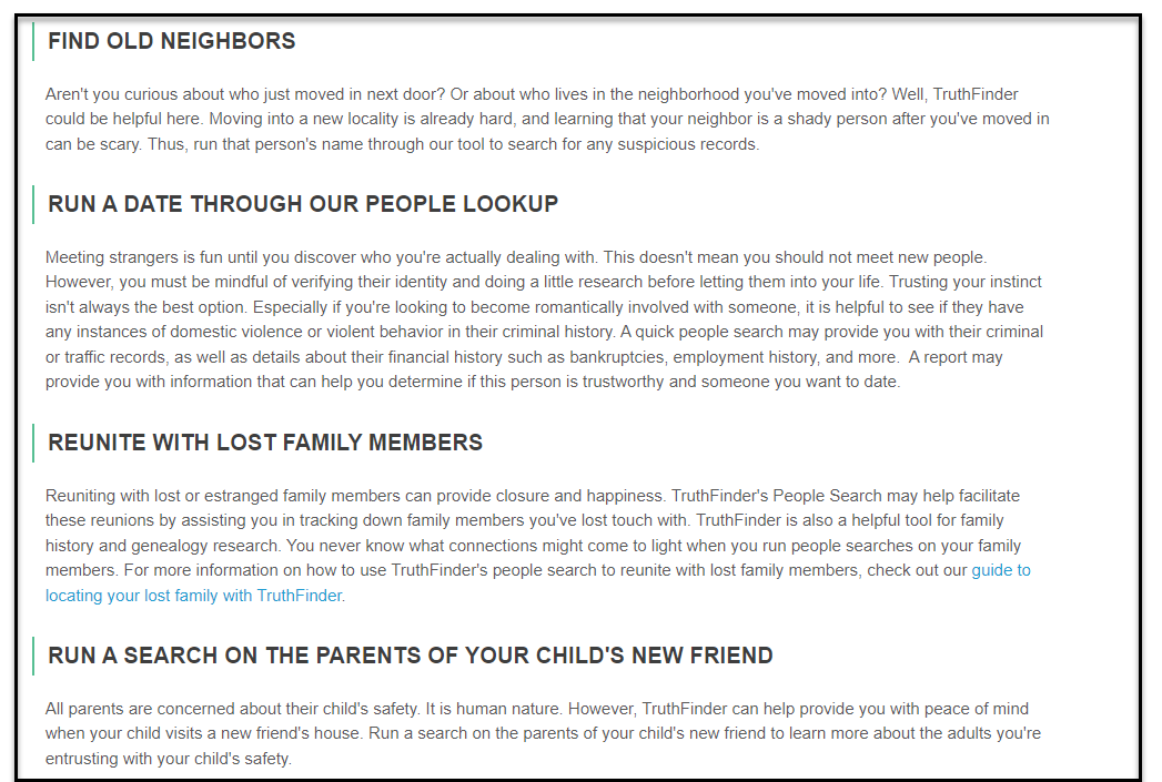
In some cases, more information might be needed. For example TruthFinder, a people search tool is used to find old neighbors, run a date through people lookup, and more. Having these use cases on a landing page allows a potential customer to more easily choose one service over another.
Trust Elements
Lastly, it is important for you to put your audience’s mind at ease and prove why they should give you their money or email.
Consider putting a company logo in clear view, or some form of branding, to instill a sense of legitimacy. Testimonials from former customers or industry-leading experts help achieve this.
For example, if you are an SEO services provider, a graph showing your annual growth, as well as some of your clients, would create that trust element.
While some businesses may be tempted by offers of cheap SEO, investing in quality services often yields better long-term results and credibility.
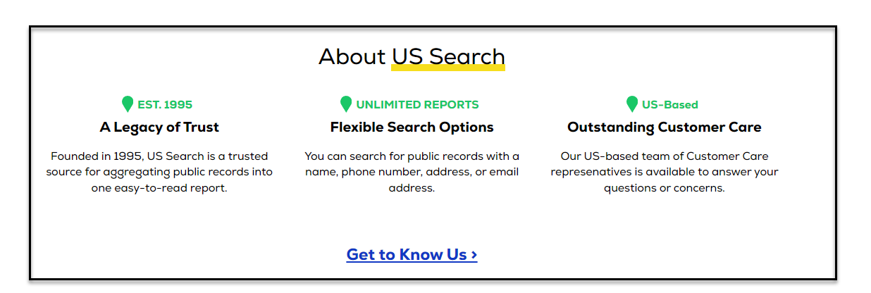
On the other hand, if you are providing any other services or have a tool, the year of establishment can help build trust (Just like the company US Search mentioned it).
It’s all about what will increase the likelihood of your audience interacting with your brand. Trusting what you say is half the battle.
Even if you are sure that your web page looks trustworthy and well-designed, you still need more to stand out and become clearly visible online. That's why implementing the right SEO services is key to digital visibility.
After all, they ensure your web content is harmoniously blended with proper keywords and high-quality links. But how do you make your web page rank high in search engine results? And what about your potential customers who should be able to easily find it?
An expert team of specialists can take care of that. If you want your web content to be relevant, easily discoverable, and accessible by your TA, you simply can't go without professional SEO assistance. That's why it's all about making the right choice of a suitable agency.
Optimizing your landing pages
There are multiple ways to go about optimizing your landing pages.
A/B testing is where you have two or more versions of a landing page and you put both out there to see which one works better/ has a higher conversion rate.
You could test things such as:
- CTA Buttons – changing their location/content/size/color etc.
- Subheadings and bullet-point information
- Videos
- Images
- Adding or removing animations
- Testimonials
- Length of page scroll
- Page layout
- Etc.
For basic split testing, avoid making more than one change at once. Otherwise, you would be unsure what change affected the increase or decrease in conversion rate.
Most landing page builders offer this feature as part of their plans.
To do this for free and manually, you can use Google Optimize – a useful tool developed by Google that lets you make changes to your landing pages and test them based on specific criteria.
Finally, I would recommend checking out some useful tools such as Landing Page Graders – Unbounce offers a free one and so does WordStream.
Conclusion
You should now understand the importance of having a high-converting landing page, and how to build one step-by-step.
To summarize the steps:
- Market Research – be specific and understand your audience’s needs
- Clarify your desired action and what a visitor gets in return for taking it
- Choose your tools – how are you going to build the landing page?
- Design your landing page – headline, visual and trust elements, and information
- Optimize your landing page
Continue tweaking your page until you’ve arrived at a conversion rate, you’re happy with.
Jamie Ashley is the founder of The E-Commerce Entrepreneur, and a Digital Marketing and Social Media enthusiast. He writes content ranging from guides to earning money online, to product reviews and tutorials.
Copyright 2018 - 2020, KyLeads. All rights reserved.
